How Color Psychology Impacts Mental Health Website Design
The right color choices can make a site feel welcoming and supportive, encouraging users to explore resources and seek help. Discover how color psychology can enhance your website’s impact.
Colors affect how people feel and think. In website design, this is called color psychology. It helps designers use colors to create specific emotional reactions. For a mental health clinic’s website, choosing the right colors can make visitors feel calm and supported. Selecting the wrong colors can do the opposite. Digital Dot will tell you how color psychology impacts mental health website design, how to use them effectively in your design, and help you choose the best colors to connect with your audience and improve your site’s experience.
The Basics of Color Psychology
Certain colors naturally evoke specific emotions. For example, blue often creates a sense of calm, while yellow can evoke energy and optimism. These associations stem from psychological and cultural meanings.
In different cultures, colors may carry unique meanings. For instance, white symbolizes purity and peace in many Western cultures but represents mourning in some Asian countries. You need to understand these differences and design your website to resonate with a diverse audience. A website designed for mental health professionals can greatly benefit from thoughtful color choices that reflect cultural and emotional considerations.
The Best Colors for Mental Health Websites
When you learn how color psychology impacts mental health website design, you will make the right choices. The right colors can make your website feel inviting, calming, and trustworthy. Here are some of the best colors to use:
- Blue
- Green
- White
- Soft neutrals
Let’s see why they work.
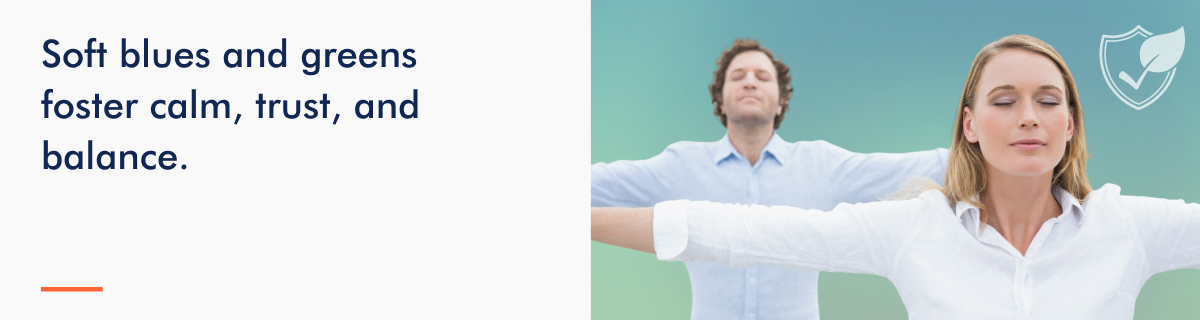
Blue: Trust, Calm, and Professionalism
Blue is one of the most trusted colors in design. It reduces stress and creates a sense of security. Use soft blues in headers or as background colors to set a calming tone. Pair them with white or neutral accents to balance the look.
Green: Growth, Balance, and Harmony
Green represents renewal and balance, making it ideal for mental health websites. Use muted greens in buttons, icons, or sections that focus on growth or recovery. Green also pairs well with other soft tones, enhancing the feeling of harmony.
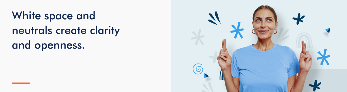
White: Simplicity, Cleanliness, and Openness
White provides a clean and open feel. It gives users space to focus without distractions. Use white backgrounds to highlight content and create an uncluttered experience. White is also a perfect base for pairing with calming accent colors like blue or green.
Soft Neutrals: Warmth and Comfort
Beige, taupe, and light gray tones create warmth and approachability. These colors are excellent for backgrounds or section dividers. They add a subtle depth without overpowering other elements.
Here are some examples of how you can use these colors:
- Headers: A soft blue or green header can make navigation feel approachable.
- Backgrounds: White or soft neutrals create a clean and calming backdrop.
- Accents: Use green buttons or blue highlights to guide users’ attention without overwhelming them.

Colors to Avoid and Why
Using the wrong colors on a mental health website can create stress, discomfort, or even mistrust. Here are the types of colors to avoid and the reasons why:
- Overly bright or harsh colors – Colors like red, neon pink, or bright yellow can feel jarring and overwhelming. Red, for example, often triggers feelings of urgency or danger, which is unsuitable for a calming environment. Neon shades can overstimulate visitors, making the site feel chaotic.
- Excessive use of dark colors – While darker tones like black or deep gray can add sophistication, using them excessively may make the website feel heavy or unwelcoming. This can discourage users who are already feeling vulnerable. If you use dark colors, balance them with lighter, softer tones.
- Clashing color combinations – Colors that clash, like bold red paired with bright green or multiple neon shades together, can be visually overwhelming. These combinations create confusion and distract users from your message. For a mental health website, the goal is to keep the design cohesive and soothing.
Instead, you should stick to a balanced palette with soft, complementary tones. Limit the use of bold colors to small accents like call-to-action buttons. Keeping the design cohesive and soothing for mental health websites supports your goal to break the stigma around mental health treatment by making the experience approachable and supportive.
Balancing Color with Accessibility
A mental health website must look good and be accessible to everyone, including those with visual impairments or color blindness. Here’s how to ensure your design is both calming and accessible:
- Ensure color contrast meets standards
- Design for visual impairments and color blindness
- Use accessibility testing tools
Ensure Color Contrast Meets Standards
Text and background colors must have enough contrast to be easily readable. Follow the Web Content Accessibility Guidelines (WCAG), which recommend a minimum contrast ratio of 4.5:1 for normal text and 3:1 for large text. For example, avoid light gray text on a white background, as it can strain the eyes. Instead, pair darker text with lighter backgrounds or vice versa.
Design for Visual Impairments and Color Blindness
Some users may struggle to distinguish certain colors. For example, people with red-green color blindness might not differentiate between those hues. Use patterns, textures, or clear text labels instead of relying solely on color to convey meaning. For instance, buttons can have both color and text to ensure all users understand their purpose.
Use Accessibility Testing Tools
Several free tools can help you test your website’s color accessibility:
- Contrast checkers: Tools like WebAIM’s Contrast Checker or the Contrast Ratio tool help ensure your colors meet WCAG standards.
- Colorblind simulators: Apps like Coblis let you see your design through the eyes of someone with color blindness.
- Accessibility auditors: Plugins like Wave or Axe can analyze your site for broader accessibility issues
Using Color to Guide User Behavior
Knowing how color psychology impacts mental health website design will help you guide user behavior. Use contrasting colors to make CTAs like “Schedule an Appointment” or “Contact Us” stand out. For instance, a soft blue or green button against a white background draws attention without feeling aggressive. Avoid blending CTAs into the background, as users might overlook them.
Also, you can subtly guide the user’s eyes by using contrasting but complementary colors. For example, use a slightly darker shade of blue for section headers to draw focus, while maintaining a light and airy design. Highlight key points or clickable elements with a pop of color, like a green underline for hyperlinks.
Here are some examples of effective placement:
- Navigation menus: Use a consistent color for the active page or hover effect, like a calming green or blue. This helps users understand where they are on the site.
- CTAs: Place CTAs in high-visibility areas like the top of the page or near relevant content. A well-designed CTA button in a contrasting but friendly color, such as soft teal, naturally invites clicks.
- Section dividers: Use soft neutrals or subtle gradients to separate content sections, making the page easier to scan and keeping attention on actionable areas.
Testing How Color Psychology Impacts Mental Health Website Design
Even the best color scheme ideas need testing to ensure they work well for your audience. Testing and gathering feedback can help refine your design. You can use:
- A/B Testing for performance – A/B testing lets you compare two color schemes to see which one performs better. For example, test different button colors for your “Contact Us” CTA to find which gets more clicks.
- Gather patient feedback – Ask users directly about their experience with your site’s design. Questions like, “Did the colors make you feel calm and supported?” can guide improvements.
- Iterate based on analytics and input – Review website analytics to see how users interact with your site. If you notice high bounce rates or low CTA engagement, consider adjusting colors to improve clarity or emphasis.

Enhance Engagement with Better Design
It is important to know how color psychology impacts mental health website design. Thoughtful color choices will make your mental health clinic’s website a welcoming, supportive space. By using calming tones, avoiding overwhelming colors, and focusing on accessibility, you can build trust and keep visitors engaged. Take a moment to evaluate your clinic’s current website. Does the color palette create a sense of calm and professionalism? Are CTAs easy to spot and inviting? If not, you should refine your design. If you need expert guidance, contact Digital Dot for professional advice on website design and mental health marketing. We will help you create a site that combines effective color psychology with a seamless user experience.